Color Selection
Project description
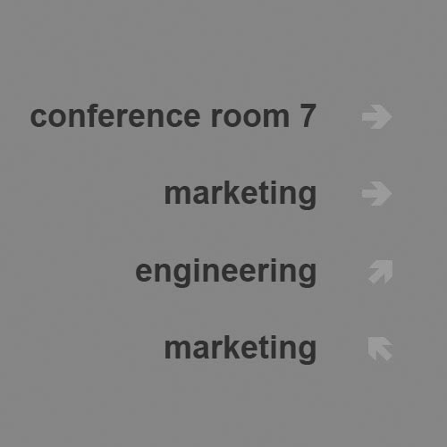
 The objective for this project was to create a wayfinding sign for a corporate facility housing teams that design and sell software products. The design needed to work in a high-end contemporary space and convey information with a minimum of symbols. Grays are a good place to start for type because their value can be adjusted up or down to work in many environments. Each line on the sign was composed of a "what" portion in a sans serif typeface and a "where" portion provided by an arrow. The components are shown above.
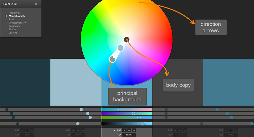
 Adobe Kuler was used as a visualization tool to develop a palette of colors generally aligned with the monochromatic model. The background and body copy share hues but have different values (brightness value). The arrows are meant to pop off the background and were chosen from complementary colors.

The finished wayfinding sign.